CAGD 493
Senior Portfolio - CAGD 493 - Spring 2024
Final Blog Post 5/13-5/22
Time-lapse video of unfinished drawing
Sadly, I failed to accomplish much this semester. I feel that my initial plan was workable, although I probably could have added extra time budget to several items. My main problem was an overall failure to put in work consistently. Creative burnout has been a major issue for me. It would have been nice to have an organized portfolio.
What were your goals this semester?I had wanted to flesh out my 2D concept artist portfolio. My initial goals were to redraw a selection of generally backgroundless figures that I had composed over the years, in my current style, with proper attempts at backgrounds and directional lighting. I also generated a number of images using Midjourney AI tools, with the intention of redrawing them to correct for some of the mistakes computer-generated imagery tends to have, such as lack of focus and perspective. I also set aside some time to work on some pixel art, possibly with the idea of following tutorials. Finally, I highlighted several game project ideas that I wanted to draw up storyboard style manuals for, with diagrams illustrating how to complete actions and how to fight enemies.
This is probably my final year at Chico State, as I will hopefully be passing College Geometry and attaining the final units of upper division math needed for my Math Minor, to complement my already achieved CAGD Major and Comp Sci Minor. I had hopes to balance the time with a creative class focused on using skills that would be applicable for general commercial work.
Did you achieve your goals for the semester?I did manage to make one post to my ArtStation portfolio showing some of the pixel art work I had done over the summer, but without the commentary and progress notes I had hoped to write up.
Unfortunately, I did not get past my first complex drawing. After a good number of revisions, I had blocked out a background and a general pose for my Lion Frog character that I was somewhat happy with. I had been hoping to decide on a final line and texture style for the background before filling in more character detail, but I did not make much progress.
What worked and didn't?I started this semester horribly burnt out from years of continuous academic work while dealing with emotional and focusing difficulties and their paired psych meds. My lack of results both for this project and for a school club's project show that I'm not yet ready to work consistently for commercial creative work, at least where art is concerned, which is good to know.
I simply did not manage to put in the hours needed. I estimate I have an average of ninety minutes per week over the course of the semester put into my drawing. Work was generally smooth when I sat down with my pen tablet, but wrangling myself into starting the work on any given day was hard. By the end of the semester, I was so disgruntled with myself and low on directed energy that it took me an extra week to sit down and type up a proper final blog.
I'm happy with the work I put into my lion frog sketch and background. I redrew the outlines several times, narrowing in on a direction I was comfortable with. My main regret is that I didn't manage to progress far enough to put more practice into my lighting, perspective, and 'camera focus' skills.
What would you do differently in your project?Above all else, I should have stuck with my idea of rotating tasks and changed directions when I was scheduled to, even though my first project was unfinished. At the very least, I could have thrown myself into pixel work based on guided tutorials to help me accumulate work hours and proper weekly blog posts, rather than the scattered notes of someone hitting a mental brick wall.
What were your goals this semester?
I had wanted to flesh out my 2D concept artist portfolio. My initial goals were to redraw a selection of generally backgroundless figures that I had composed over the years, in my current style, with proper attempts at backgrounds and directional lighting. I also generated a number of images using Midjourney AI tools, with the intention of redrawing them to correct for some of the mistakes computer-generated imagery tends to have, such as lack of focus and perspective. I also set aside some time to work on some pixel art, possibly with the idea of following tutorials. Finally, I highlighted several game project ideas that I wanted to draw up storyboard style manuals for, with diagrams illustrating how to complete actions and how to fight enemies.
This is probably my final year at Chico State, as I will hopefully be passing College Geometry and attaining the final units of upper division math needed for my Math Minor, to complement my already achieved CAGD Major and Comp Sci Minor. I had hopes to balance the time with a creative class focused on using skills that would be applicable for general commercial work.
Did you achieve your goals for the semester?
I did manage to make one post to my ArtStation portfolio showing some of the pixel art work I had done over the summer, but without the commentary and progress notes I had hoped to write up.
Unfortunately, I did not get past my first complex drawing. After a good number of revisions, I had blocked out a background and a general pose for my Lion Frog character that I was somewhat happy with. I had been hoping to decide on a final line and texture style for the background before filling in more character detail, but I did not make much progress.
What worked and didn't?
I started this semester horribly burnt out from years of continuous academic work while dealing with emotional and focusing difficulties and their paired psych meds. My lack of results both for this project and for a school club's project show that I'm not yet ready to work consistently for commercial creative work, at least where art is concerned, which is good to know.
I simply did not manage to put in the hours needed. I estimate I have an average of ninety minutes per week over the course of the semester put into my drawing. Work was generally smooth when I sat down with my pen tablet, but wrangling myself into starting the work on any given day was hard. By the end of the semester, I was so disgruntled with myself and low on directed energy that it took me an extra week to sit down and type up a proper final blog.
I'm happy with the work I put into my lion frog sketch and background. I redrew the outlines several times, narrowing in on a direction I was comfortable with. My main regret is that I didn't manage to progress far enough to put more practice into my lighting, perspective, and 'camera focus' skills.
What would you do differently in your project?
Above all else, I should have stuck with my idea of rotating tasks and changed directions when I was scheduled to, even though my first project was unfinished. At the very least, I could have thrown myself into pixel work based on guided tutorials to help me accumulate work hours and proper weekly blog posts, rather than the scattered notes of someone hitting a mental brick wall.
Blog 13-14, Weeks 13-14: Layering, 5/5
I've only put in a bit of work these past weeks. Here is the current sketch.


Blog 12a, Week 12: Layering, 4/17
I've decided to try and chunk out the swamp before continuing with the main character, as one of my main stated goals for the semester was improving my backgrounds. I managed to put in an hour of work before class. I also exported a timelapse to show off my progress so far. Again, I had hopes of completing this work in the first two weeks of the semester. Oh well.


Blog 11, Week 11: Layering, 4/10
Sadly, I still am having a rough time engaging with my brain's executive function enough to dive into creative work. I managed to start sketching about forty-five minutes before class. This is what I've made so far. I believe I have the facial proportions better on model for an amphibian, but there's still a lot of work ahead of me.

Blog 9&10, Weeks 9&10: Spring Break, 4/7
I unfortunately did not make progress over Spring Break or the weeks following. I will try to throw something together by Wednesday.
Blog 8, Week 8: Sketching, 3/17
I practiced a bit with using the various art tools in Clip Studio Pro alongside my Wacom pen tablet, mostly going over the lower-left of my sketch. The left side of the screenshot is charcoal and chalk pastel, while the middle is pen, and the right is spray paint. I think I like the charcoal and chalk texture the best? I also played around with the blur tool. It's been awhile since my concept art classes, so I hope to spend Spring Break following some tutorials in order to narrow down on a consistent style.

After I added some extra depth to the base of the trees, I decided to try inking the outlines of the drawing. Being able to select and mask similar parts of the drawing should hopefully help me keep my palettes and textures consistent. I'll also be redesigning this using basic forms, turning the eyes into spheres and the trunks into cylinders, to help with the shading.


I'm narrowing in on which flat colors I want to use to fill out the background and the island, as well as the fallen log in the foreground. This should help give me a better handle using my current tools, before I dive into finalizing the lines of the main figure. I hope to increase the length of the rear legs to properly frog like proportions, as well as anchor a lion's tail, in the next iteration.
After drawing a circle underlying the face, I have come to realize that the proportions are rather Muppet like, as in the character Animal. This is less frog like than my original pen sketch, so I will be raising the muzzle and increasing the width between the eyes, ensuring the overall face shape is more of an oval than a circle. One of my goals in the original concept sketch was ensuring the head slope retained a proper frog silhouette in the side view, so I'll keep a closer eye on that as I move forward.


Blog 7b, Week 7: Sketching, 3/10
I did very little this week. I bought a Procreate tutorial book, in hopes of starting up with sketching on my iPad. I had been having problems sketching using my pen on my computer, so I also decided to see how far I could get in half an hour just using my mouse. The results turned out fairly well? I still want to add the details and linework using a pen. I had someone comment that my earlier work resembled a goblin lion, so I leaned into that a bit more heavily. I think I have a nice balance with the foreground and background trees rising from the waters of the swamp, but I will be adjusting them as I go.


Blog 7a, Week 7: Planning, 3/6
I decided to download the Adobe Animate program before class and start tracing my original LionFrog sketch into a vector image. I did not get very far, but the technique and the interface feels generally familiar. I hoped to be much further along by the midpoint of the class...


Blog 6, Week 6: Planning, 3/3
I'm still fighting extreme creative block and a failure in executive function. At least my math class is going well... In the absence of forward motion on concept art, I hope to engage my practical skills with some productive tracing. Given my past work with Adobe Flash, I should be able to translate my existing LionFrog pencil sketch into an animated vector image, complete with head bob, blinking eyes, and a new tail that lazily waves. I believe I will be using the ToonBoom animation suite for this, or similar.
In order to have something to show work progress, I'll be diving into some design tutorials. Tutorial-based results are not ideal things to show in a creative work portfolio, but I hope that active skillbuilding will help me attain some forward momentum in this class.
Blog 5, Week 5: Resources, 2/25
Slow week for creative work, unfortunately. I bought some hybrid animal and landscape reference books, but did not follow through on the exercises yet. I believe I need to refactor the scope and dates for my portfolio project. I have my College Geometry midterm on Thursday, so organizing around that will be interesting. The final version of the shortened cover letter is due tomorrow, along with an overview of my blog. Hopefully, I can sustain productivity through the morning...
On the bright side, I was accepted as a 2D Concept Art Designer for the CGC team project, with a focus on building a jungle island surrounding a biolab. I showed off the vine frog concept art I made with Midjourney last week and my team lead liked the direction. I'll probably retune my portfolio goals for this semester around things that can also work for that project. First off, adjusting my planned landscape concept art to include overhead views, and maps with legends.
Blog 4b, Week 4: Repaint, 2/18
Sadly, I failed to work consistently on my homework this week. In order to have something more done, I generated some focused images using MidJourney. My first pass involved a basic lionfrog request, followed by prompts for a swamp background. Finally, I asked the bot to blend my previous work with some reference images. This was informative, in that I have decided to try and incorporate a lion's tail going forward.
To me, the most unexpected result from the AI was the first image shown here, where the lionfrog's mane is made from woven ivy. That's not something I'd necessarily like to use for this project, but I do it find to be a neat concept.


Blog 4a, Week 4: Repaint, 2/14
This week, I worked a bit on redrawing my Lion Frog whose name is Leon. I enjoy the concept as he comes across as an unusually happy fuzzy crocodile. Here are some sketches I made, trying out different poses, as well as an overhead view of the layout.


For background reference, I'm using Frank's neat swamp scene from Zoom chat. There's some extra sunlight on the left third, but it is overall a scene muted by the thick overhead foliage. Seems a good starting spot.

Here are some old poses of my Lion Frog.


Blog 3b, Week 3: Job Skills, 2/11
I had a good time this Friday brainstorming through some game design idea maps with people from the Computer Graphics Club. Here's the main one I helped contribute to.

About twenty students, including myself, are setting up a semester-long game jam to improve our design skills. Pitches are next week, so I may go ahead and share my planned Pumpkin Bunny presentation with them, in hopes of forming a team? Will see how that goes.
My main surprise from this week of job skills was that the main software experience for potential storyboarders according to the shared job listing resource was a program called Toon Boom Storyboard Pro 22. I have heard great things about Toon Boom Studio as the main alternative to the discontinued Adobe Flash animation suite, so it is good to know that they are diversifying their product line. I've downloaded their Free Trial version and will be checking out their system flow. Ideally, I'll be using it as part of my game design presentations this semester.
Unfortunately, I did not do much drawing this week besides some thumbnails of how the lion frog redraw might look with a proper background. I should have an easier workflow for the rest of the semester now that I have my Cintiq tablet plugged in and my drivers updated.


Blog 3a, Week 3: Job Skills, 2/7
I ran through the job listing resource offered by my teacher to find a remote Graphic Designer / Illustrator job offered by yU+CO out of Hollywood. The in-class review went generally well. However, I was advised to lead with a more focused professional summary and a shorter cover letter.

Blog 2, Week 2: Job Skills, 1/29
Took a few minutes to update my résumé before class. Sadly, it is not much improved over my 2022 version. I have taken some business courses, such as Survey of Marketing and Survey of Management, that I may add into my bio if it would help with targeting the specific job opening I am interested in. I may or may not cite my experience with playing with MidJourney here, rather than only showing my redraws in my Concept Art Portfolio.

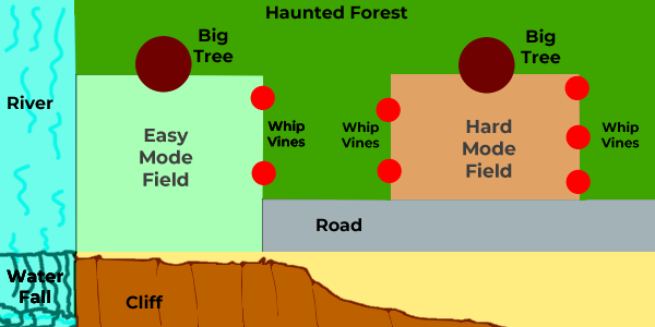
Basic Deliverables for Pumpkin Bunny Presentation, due 4th week:
- Cinematic Storyboards
- Opening Scene of the haunted forest invading the pumpkin fields
- Closing Scene of the medal ceremony celebrating Pumpkin Bunny
- Optional Bad Ending Scene of Pumpkin Bunny losing the fields
- Illustrated Manual Pages
- Leaderboard
- Harvest
- Combat
- Background Art
- Bunnyville Map
- Basic Field
- Advanced Field
Pumpkin Bunny is an action/farming game where the player plants carrots and pumpkins, some of which may be turned into explosive jack-o-lanterns, in order to defend against the haunted forest. I've been working on bits since 2021, including this map showing the basic layout.
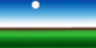
In other news, last month I updated my Whole Punch 64 palette with an example in the 464x120 pixel resolution that Lospec requires. It took me about four tries to come up with a good example; I'm glad that one was finally accepted by the site management. This is my old pixel art hallway updated with some purples and shadows to show off the full palette and shrunk to fit the frame. This was made in Aseprite, which I prefer using for pixel art over the Adobe Creative Suite. I have the option for adding experience with this program as a skill if it helpful for the specific job listing. For this class, I have uploaded the base image to my ArtStation portfolio, but I have yet to add details.
Blog 1b, Week 1: Planning, 1/27
Before Monday Class, I plan to hook my drawing tablet up to my computer and warm up with some sketches. I hope to update my résumé to what it will be when I graduate. I'd also like to select the two pieces of MidJourney art that I want have redrawn by the end of Week 2. Finally, I'd like to refresh my memory of how to create an ArtStation entry by uploading the pixel art hallway I remade over the Summer.
For my cover letter assignment, I mainly plan to seek out job listings involving concept art and user interface design. My main programming skills remain firmly in the domain of Unity and C# although I have occasionally attempted to learn Python. I have a decent background in writing game design documents and storylines, which might also be of some use.
Here are my main picks for the eight pieces of my original art I'd like to redraw over the first half of the semester. Most of them are from various concept art classes I've taken over the years, drawn to practice the fundamentals of character design.
Original Art to Redraw (Initial Schedule):
Weeks 1-2


Weeks 3-4


Weeks 5-6


Weeks 7-8


In no particular order, here are some candidates for the sixteen pieces of MidJourney AI generated art pieces that I may choose to redraw this semester. I've been playing with the application since about July 2023, and I'm definitely impressed with some of the nonsense I've been able to pull from it.


Blog 1a, Week 1: Planning, 1/26
Oh, dear. I'm starting what is hopefully my last semester at Chico State. If all goes well, I'll complete the last math class I need for my trifecta of CAGD Major, CSCI and Math Minors, and finally graduate. I wanted to balance College Geometry with a creative class, so this marks my fourth attempt at organizing a Senior Portfolio, after a C and 2 Fs in previous semesters. My main listed focus is Concept Art / 2D Animation / Storyboarding. I hope to assemble a body of work by the end of the semester, showing off my skills with art uploaded each week to my ArtStation Portfolio and a number of PowerPoints showing off storyboards that illustrate some of my game design projects.
General Time Allocation per Week:Drawing My Art: 2 hours, Redrawing AI-Generated Art: 2 hours, Game Design: 4 hours.
- Weeks 1-4
- Redraw Lion-Frog, Snake Shaman, Owl Landscape, Jackalope
- Redraw four pieces of MidJourney Art
- Assemble Presentation of Pumpkin Bunny Game Design Storyboards
- Weeks 5-8
- Redraw Bird Princess, Alien Monster, Alien Cowboy, Pangolin
- Redraw four pieces of MidJourney Art
- Assemble Presentation of Moonlight: Queen of Wolves Game Design Storyboards
- Upload YouTube Video of my drawing process
- Weeks 9-12
- New Landscapes: Mountain River, Underworld, Swamp, Seafloor
- Redraw four pieces of MidJourney Art
- Assemble Presentation of Clean Sweep Game Design Storyboards
- Weeks 13-16
- New Pixel Art: Character Turnaround, Armor Set, Map, User Interface Icons
- Redraw four pieces of MidJourney Art
- Assemble Presentation of Star Trader: TFD Game Design Storyboards
- Upload YouTube Video of my drawing process
This is a general outline of my goals, as I may wind up swapping out one of the adventure game designs for something simpler to present, such as Dragon Tic-Tac-Toe. I will also hopefully be joining in several game jams, such as the Chico State edition of the Global Game Jam that happens at the end of Week 2, and documenting my progress there.
I plan to spend the next several weeks designing a presentation for Pumpkin Bunny that will include storyboards presenting cinematics, as well as PowerPoint slides representing an illustrated operations manual for planting crops, harvesting, and combat. Pumpkin Bunny currently exists as a short game design document with fleshed out mechanics, but no clear art style, so I have a decent amount of work ahead of me. I hope to have at least a blob and stick figure rendition of the main cinematics and mechanics by the end of Week 3 and a finished presentation by the end of Week 4.
I am very entertained by some of the results I have generated from my past year of experimenting with MidJourney AI, and I'd like to use them as the basis for creating new art. I plan to occasionally livestream through Twitch as I redraw these images and some of my own old art, so that I can compile the footage into YouTube videos illustrating my general process. While I hope to consistently upload my completed art pieces to my ArtStation portfolio each week, I expect the video editing process to be complex enough that I'll only upload videos at the midpoint and the end of the semester.
My main personal art goal for this class is practicing drawing characters within a scene and lighting them properly. Most of my art experience has been creating characters and backgrounds independently, so I'm definitely happy to take this chance to create art pieces as a cohesive whole. With the MidJourney AI art, I have a great body of reference for lighting and setting, but the pieces tend to have a large problem with focus and perspective, so I hope to delve into the proper mechanics for bringing depth to a scene as I go.
Oh, dear. I'm starting what is hopefully my last semester at Chico State. If all goes well, I'll complete the last math class I need for my trifecta of CAGD Major, CSCI and Math Minors, and finally graduate. I wanted to balance College Geometry with a creative class, so this marks my fourth attempt at organizing a Senior Portfolio, after a C and 2 Fs in previous semesters. My main listed focus is Concept Art / 2D Animation / Storyboarding. I hope to assemble a body of work by the end of the semester, showing off my skills with art uploaded each week to my ArtStation Portfolio and a number of PowerPoints showing off storyboards that illustrate some of my game design projects.
General Time Allocation per Week:
Drawing My Art: 2 hours, Redrawing AI-Generated Art: 2 hours, Game Design: 4 hours.
- Weeks 1-4
- Redraw Lion-Frog, Snake Shaman, Owl Landscape, Jackalope
- Redraw four pieces of MidJourney Art
- Assemble Presentation of Pumpkin Bunny Game Design Storyboards
- Weeks 5-8
- Redraw Bird Princess, Alien Monster, Alien Cowboy, Pangolin
- Redraw four pieces of MidJourney Art
- Assemble Presentation of Moonlight: Queen of Wolves Game Design Storyboards
- Upload YouTube Video of my drawing process
- Weeks 9-12
- New Landscapes: Mountain River, Underworld, Swamp, Seafloor
- Redraw four pieces of MidJourney Art
- Assemble Presentation of Clean Sweep Game Design Storyboards
- Weeks 13-16
- New Pixel Art: Character Turnaround, Armor Set, Map, User Interface Icons
- Redraw four pieces of MidJourney Art
- Assemble Presentation of Star Trader: TFD Game Design Storyboards
- Upload YouTube Video of my drawing process
This is a general outline of my goals, as I may wind up swapping out one of the adventure game designs for something simpler to present, such as Dragon Tic-Tac-Toe. I will also hopefully be joining in several game jams, such as the Chico State edition of the Global Game Jam that happens at the end of Week 2, and documenting my progress there.
I plan to spend the next several weeks designing a presentation for Pumpkin Bunny that will include storyboards presenting cinematics, as well as PowerPoint slides representing an illustrated operations manual for planting crops, harvesting, and combat. Pumpkin Bunny currently exists as a short game design document with fleshed out mechanics, but no clear art style, so I have a decent amount of work ahead of me. I hope to have at least a blob and stick figure rendition of the main cinematics and mechanics by the end of Week 3 and a finished presentation by the end of Week 4.
I am very entertained by some of the results I have generated from my past year of experimenting with MidJourney AI, and I'd like to use them as the basis for creating new art. I plan to occasionally livestream through Twitch as I redraw these images and some of my own old art, so that I can compile the footage into YouTube videos illustrating my general process. While I hope to consistently upload my completed art pieces to my ArtStation portfolio each week, I expect the video editing process to be complex enough that I'll only upload videos at the midpoint and the end of the semester.
My main personal art goal for this class is practicing drawing characters within a scene and lighting them properly. Most of my art experience has been creating characters and backgrounds independently, so I'm definitely happy to take this chance to create art pieces as a cohesive whole. With the MidJourney AI art, I have a great body of reference for lighting and setting, but the pieces tend to have a large problem with focus and perspective, so I hope to delve into the proper mechanics for bringing depth to a scene as I go.
Senior Portfolio - CAGD 493 - Fall 2022
Fourth Blog 10/3-12/4
I had hopes of making something coherent by now out of the New Zealand footage I am shooting on my vacation, but I managed not to start typing this blog until ten minutes before midnight back in California. Sigh.


I had hopes of making something coherent by now out of the New Zealand footage I am shooting on my vacation, but I managed not to start typing this blog until ten minutes before midnight back in California. Sigh.


Third Blog 9/5-10/2
I'm coming back into this blog a month later with little new work. I dropped Digital Texturing as I was having massive problems following through on creative tasks. I missed out on the Septembit compilation and several game jams, and my Artstation portfolio still lacks content uploads. I put some time into some following some basic shading and pixel placement tutorials, such as tracing over onion skins of pixel art sprite sheets downloaded from The Spriters Resource. I don't have much to show, but I'm happy to have started something constructive.
Second Blog 8/29-9/4
I am still looking around for ideas. I worked on vector images last semester, which I can spend time uploading to my Artstation Portfolio this week. I just saw that Spacebattles is having a logo design contest, which ends next Wednesday, so I may offer several entries and share them here. My other two classes this semester are Digital Texturing and Video Game Pre-Production, which may help improve my skills as time goes on.


Vector images from my Spring 2022 Digital Fundamentals class
If I do create some game jam entries they would help fill out my itch.io profile. I also hope to use that profile to create and market downloadable pixel art packs for people to use in their games, in the vein of artists such as CazWolf, but that may be a project for the future rather than for this class.
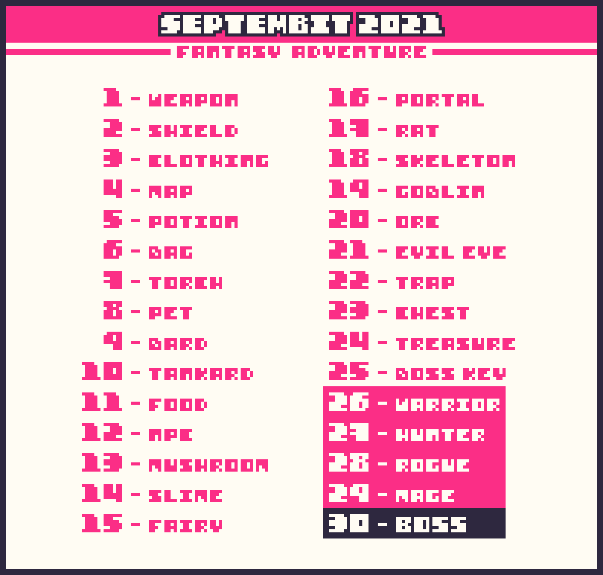
Off and on during September, I will probably be filling out Saultoons' month long challenge of building a base of pixel art following a four-color palette. Last year I animated ten of the daily prompts, and I'm hoping to get much further into the challenge this year so that my work can be shown in the Septembit compilation video.


Septembit Prompt Sheet
Something that I would like to try is building a game where the art and characters are made on a 64x64 pixel canvas scale while the text and interface are scaled to 128x128. This means that the pixels for the characters are sixteen times larger than the ones making up the text, which is a resolution pairing I've seen people make some cool stuff in. If I can't come up with a more original idea, then I may remake a past team game jam entry, Micro-Management, in the new art style.
- 8/29-9/8 Practice 64x64 resolution concept art. This might be a good time for me to break open a new Udemy course on pixel art as a refresher from the GameDev.tv course I took in 2020.
 Possible Udemy course I might run through for needed skills
- 9/20-9/25 I may want to take a short break from pixel art and work on redrawing some of my old character and creature art using my Wacom pen display tablet and Clip Studio Pro, as I've been wanting to break into that workflow. I may stream this concept art process on my Twitch channel and edit the result into a YouTube video.
- ... And that is what I have so far. I need some more ideas for the remainder of the semester.
- 11/6-12/8 Oh, right! I will be on vacation in New Zealand for a month, touring some universities for graduate programs. While I'm there, in addition to my regular work, I may take some landscape shots and create/expand the section on my Artstation Portfolio dedicated to Digital Photography.

Possible Udemy course I might run through for needed skills
- 9/20-9/25 I may want to take a short break from pixel art and work on redrawing some of my old character and creature art using my Wacom pen display tablet and Clip Studio Pro, as I've been wanting to break into that workflow. I may stream this concept art process on my Twitch channel and edit the result into a YouTube video.
- ... And that is what I have so far. I need some more ideas for the remainder of the semester.
- 11/6-12/8 Oh, right! I will be on vacation in New Zealand for a month, touring some universities for graduate programs. While I'm there, in addition to my regular work, I may take some landscape shots and create/expand the section on my Artstation Portfolio dedicated to Digital Photography.
First Blog 8/22-8/28
I'm still at a loss about what I want to work on this semester. At a minimum, I hope to create content through following structured Udemy video tutorial courses and participating in various game jams. I'd really like to make some YouTube videos showing off my concept art design process.
- 9/9-9/19 I'm one of the mods for the Twitch channel hosted by indie game dev Vimlark, so I'll probably be joining his VimJam 3. I'll more than likely make an entry using some original pixel art assets and some modified from pre-made pixel art packs, such as those by Kenney.
 Screenshot of Twitch streamer Vimlark playing The_Worst_Vibes' 64x64 + 256x256 game jam entry

Senior Portfolio - CAGD 493 - Fall 2021
Final Blog 12/10-12/16
I put very little work into any of my classes this semester. Shame that this one also suffered. Was fun to see the creative work of other people and listen to great critique advice from Frank Pereira!
Fourteenth Blog 12/3-12/9
Yeah, my apologies for getting a low grade in this class due to lack of consistent output. Main thing I did was practice making color ramps - which does make Whole Punch 64 looks nicer than my older ordering.


Thirteenth Blog 11/18-12/2
I had a good Thanksgiving break overall, but accomplished little towards the goals of this class. I spent awhile trying to translate into chalk pastel my friend Rachelle's favorite photo of herself and her puppy Fiel, but it is still very much a work in progress. There's a large number of dense shadows and overlapping arms and legs so it has been an interesting challenge so far.


Twelfth Blog 10/12-11/18
I did not do much that was physically constructive this week, partially because I turned 37 on 11/18 and had some of my focus on my birthday. Instead, I spend a good number of hours obsessed with creating a good color palette for flesh tones. This is somewhat odd considering that most of my pixel art projects rarely concern humans, tending towards robots or animals, and my chalk pastel art drawing focuses on capturing the human form using neon or monochrome shades. I believe my main drive to this end is simply that the Lospec forums contain few palettes appropriate to the task of capturing multi-ethnic skin tones and I wanted to contribute something useful.

I had three unsuccessful attempts where I pulled samples directly from photos of people and tried to use the color-palette reducing feature of Aseprite to eliminate those that were too close to those already existing in my Ranged Punch 32-color palette. Unfortunately. this wound up swapping out many of my colors for muddied tones half-way in between two examples. On the final pass for Whole Punch 64, I skipped the complicated bits and simply added about 32 colors one at a time, pulling each one into an existing color ramp and seeing if it was distinct enough myself rather than relying on an automated system. This proved successful and Whole Punch 64 is now in the queue to be published on the site.


For whatever reason, the Aseprite default setup has decided that one of the yellows I chose is close-enough to being a grey so that it can swap it in anywhere there are enough greys. Hence, my face turns yellow and the grey background shadows for the two other images now have yellow highlights. This is not an issue that would actually appear in human-drawn pixel art so I feel like I have achieved my goal of producing a 64-color palette generally useful for skin tones and games in general. We'll see how it pans out.
Tenth & Eleventh Blog 10/29-11/11
Did very little. Made some headway in the three-color artwork. Redesigned the shield based on feedback, now have a total of eight images at the eight frame animation stage. It took some searching, but it turns out that you can click-and-drag across multiple frames in a layer in one document in order to copy the entire layer and paste it into another Aseprite document. Just shift-clicking only selects one or two frames in the layer, without visually showing which ones they are, so I'm glad I found the simpler method.

Beyond that, the main thing I worked on was expanding my original Ranged Punch 32 color palette to a Whole Punch 48 color palette in hopes of having more useful ramps of warm and cool colors, in addition to a larger pool of shades compatible with skin colors.

First experiment with 32 colors loosely expanded from the NES game Punch-Out

New 48-color "Whole Punch"

Ninth Blog 10/22-10/28
Nope. Failed to space things out and have a headache on the last day. My apologies. I'll try to put something together before class. Here is my first run through of the Ranged Palette sheet as animated pixel art. It is interesting compared to the three-color original, but needs work.


Did some concept art work for another class showing an image of a plate projected onto a staircase. Will probably go back in and change this to a digital painting with brushstrokes rather than a mostly vector-based image.

Eighth Blog 10/15-10/21
Did very little work this week. On the plus side, the forest grove pixel art banner example I commissioned from Jae Lehman for Ranged Punch turned out great.
Trying out some different techniques for taking my 24x24 3-color animated sprites and scaling them up. Here's my first attempt at scaling the axe up to a 32x32 sprite in a 32-color palette. Going to rework it to preserve symmetry, maybe try a different palette with more greys for a better gradient on the metal portions.

Seventh Blog 10/8 - 10/14
Started late, rushed through some stuff. My initial pass at a palette example for Ranged Punch was rejected on Lospec for not being 'low-spec' enough? I was confused by their wording, so I resubmitted it as a 232x60 image, scaled up. This time it was rejected as being a 'bad example of palette', which seems a much better reason. I'm working on a different piece that uses a wider range of gradients.

Not shown here is a commission I ordered from a friend to show her own take on the palette. I'm impressed with her concept art and will link to the finished piece.
Beyond that, I did two more entries in that limited palette icon challenge. They're nice, but I am behind on a lot of work for this class.


Sixth Blog 10/1 - 10/7
Did very little work this week. Restarted my Septembit work in Pixaki on the iPad, so that I could have an easier time animating each entry separately. Took me a bit to get used to the interface, but things should go more smoothly.

Decided to make an example for my posted Ranged Punch palette on Lospec. Requirements are a 464x120 banner image using at least 75% of my color set. Since I have a 32-color palette, I need to use at least 24 shades. Here's my rough draft. I wanted a forest scene with a waterfall pouring off into space - but then I realized that I was probably going to need more detail work to show off the red gradients.

Fourth & Fifth Blog 9/17 - 9/30
Managed to get an ear infection and not sleep properly. Rather than rush something out, here is an expanded version of the blog post I missed submitting last week. My plans this upcoming week are to finish Septembit - now that the month is over, as well as to redraw some of my previous games. I purchased a license for Construct 3 - one of the more HTML 5 focused game engines - and I'm hoping to convert some of my complex Unity projects into an engine that's built from the ground up with 2D in mind. Watching a low-resolution game jam, I had definitely been impressed with the fusion art style provided by drawing a 64x64 world on a 128x128 canvas. This allowed for the blockiness and simplicity of the extremely zoomed in environment to coexist with a UI and text interface that was four times as detailed as everything else in the game. I'd like to dive into that art style by redrawing existing characters from my previous games and see where it takes me.
Last week, I had worked some more on the three-color Septembit challenge, catching up to the seventeenth on my basic outlines. Still need to add a lot of detail. I'm hoping to redraw these on my iPad using the animation studio Pixaki and import them into Aseprite later. I think having one project per square will help me focus and improve the rate at which I'm able to convert each item into a short three frame animation, while still allowing me to arrange them all nicely. Working with a palette in this range has definitely been odd - at first glance I had been convinced that the compression to PNG had somehow introduced a fourth shade of black into the piece. It took me opening the image and drawing with the pen tool to realize that the liquid in the potion is in fact the same dark purple as the rest of the piece, as the contrast between it and the surrounding white is high enough to introduce a slight optical illusion.

I've also been playing around with different initial color schemes for Pumpkin Bunny using the given Indecision palette. I received some good feedback from my classmates in terms of how to round out the outline, in order to convey more of a pumpkin feel. I'm definitely planning to redraw these in a 128x128 canvas as this level of zoom does not allow for much detail on the character. Unfortunately, I missed the deadline for the game jam and have not yet made much progress on further details for this project. This does mean that I can freely switch over to a more conventional palette in the future.


Third Blog 9/10-9/16
I wasn't very productive this week. One of the main things I did was enter the Frankie's Pixel Shack weekend art challenge again, this time with fanart of the NES game Punch-Out. Pulling apart the palette, I sketched a bout between the player character and a Teenage Mutant Ninja Turtle.


Punch-Out character diagram and sketch using the palette
The Punch-Out screenshot had been shrunk poorly so the colors were bleeding into each other, because of compression errors. I pulled out about twenty-six distinct colors from the mix and laid them into my sketch. Sampling several photos of people, I added about six colors so the palette would also be able to cover more realistic flesh tones. This left me with a thirty-two color palette, which I titled Ranged Punch and submitted to the palette warehouse Lospec. It was accepted by the moderators and is in the queue to be indexed on their main page - so that's a nice feeling. Small contribution to the general community there.


Ranged Punch palette with breakdown by Dawnbringer Palette Analyzer
There's currently a Great Autumn Game Jam being run using Lospec's Indecision palette. As part of my entry, I'm working on redrawing my Pumpkin Bunny sketch in the given shades of pixel art.

Pumpkin Bunny work in progress with Indecision palette
Second Blog 9/2-9/9
I installed a Wacom Cintiq 16" tablet on my computer, very convenient to hold it as I draw. I worked in Aseprite on and off throughout the week, but did not make much progress on any specific thing. I'm a week behind in the Septembit challenge and the weapon design is the only one I'd really call finished? I'm hoping to make a second pass through the icons and add a four or five frame animation, so I'd probably add a sparkle or glint to the weapon or spin the central symbol.


First Blog 8/27-9/2
For this class I hope to hone my craft and improve my portfolio. I've several goals concerning pixel art and this seems a good path forward. I've mainly used the open-source GIMP image editor, but I'm branching out into Aseprite as it has a great set of pixel animation tools.
I think a good mid-semester project would be for me to sell an array of icons for people to use in their game development for a dollar or two on itch.io - there's a ton of great artists on there and it sounds like a fun thing to aim for. Probably something like a sheet of around 48 48x48 pixel fantasy themed pixel icons seems straightforward - with a separate sheet showing 24x24 or 32x32 versions of the icons, so they can be used in more projects or as smaller inventory icon versions.
- Second week goals
- Experiment with icon style and layout
- Work to current date on Septembit exercise
- End of September goals
- Complete Septembit exercise
- First pass on itch.io icon sheet and draft of website
In hopes of keeping myself on track, I'm joining up with Septembit, which is a 3-color pixel art challenge about filling a sheet with guided prompts. As the current theme is 'Fantasy Adventure' I can probably reuse some of my low-bit designs as templates for my higher resolution itch.io work. It's also a good tour of working in different icon sizes.


I drew some art on Tuesday. One of the game development streamers I follow, by the name of Vimlark, was having a small art jam on his Discord server. The theme was 'reflection/mirror' so I stretched it a bit and made a chalk pastel and charcoal pencil entry that had one of his pixel art monkeys 'draw' his face as a self-portrait.
He found the sketch entertaining, so I'm happy.


Prior to the semester starting, I entered an animation jam to create a intro screen to a fake Game Boy cartridge - this is what I made in Aseprite, plus several days of clean-up after the jam ended.

Senior Portfolio - CAGD 493 - Fall 2020
Final Blog 12/4 - 12/15
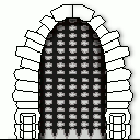
Unfortunately, I did not complete the pixel art course I was following by the due date for this blog post. I had a difficult time managing to sit down at the computer and work on creative projects without being distracted or feeling overwhelmed by my other classwork and other things going on in my life. I was able to produce a vine-covered castle hallway using a 64-color palette, but I stalled out on actually putting it in motion.
512x128 Modular Hallway using 64 Colors

This is a fast attempt of showing it by torchlight in 256-colors. Had I invested more time, the shades would be more accurate (warmer and cooler in places) and the lights would be flickering as a 256-color animated GIF. I'd also like to add glowing blue runes to the door, then have it open to reveal a ghostly figure that would pick up the candle holder and carry it off-screen.

Torch-lit Scene using 256 Colors
I'm happy with how my art progressed over the course of the semester. I plan on revisiting the earlier pixel art I made and redrawing in different styles and sizes. I'm disappointed that I don't have the quantity of work to show at the end of the semester that I expected to - and I fell far short of creating the 2D character animations I was hoping to present.


To sum up my semester, I successfully applied some of the basic animation principles to some basic 2D art and started building up my own style of low-bit pixel art.


I also finished a GameDev.TV course in motivation & structure for game design, one in LinkedIn page & application & résumé creation, and made it most of the way through an in-depth exploration of the open source art software GIMP.

That said, the largest chunk of my creative time was spent smoothing out the 3D animation for my CAGD 445 project involving posing existing character rigs to match a given audio file. I definitely hope to be better organized for my next Senior Portfolio class - and I will definitely be continuing this run of online courses over Winter Break.
Weekly Blog 10 - 11/6 to 12/3
I had a very hard time working creatively in November for various reasons. Most of my animation time was spent updating my 445 homework to the latest version. I had a hard time using Maya to animate one of the characters as only about one in every ten changes I made to the rig affected her appearance. eventually discovered my evaluation mode was set to Parallel rather than Discovery Graph - apparently DG was the default mode for Maya when than rig was first implemented. I need to put more time into animating faces, but at least my work going forward will show consistent results.


Beyond a lot of fiddly bits and math, I have little concrete work to show. I'll definitely put these skills to good use in the upcoming week.


I'm not entirely sure why it took me this long to sync my colors properly with my teammates. In any case, to work with the fourth character model included in my scene I will need to switch back to Parallel evaluation mode as DG causes her rig to explode in a rather odd light-show that fortunately doesn't appear in the Playblast camera mode where I have hidden most controls and grids.
For my tile sprite work I took my castle modular scene and reduced it to 64 colors in preparation for adding flickering torchlight that would bring the total number of colors back up to the 256 color limit for the animated gif. A weird artifact of the color indexing produced a large number of random green clumps so I connected a bunch of these with more green lines and red dots to create a mossy lichen effect that I think adds some character.


Weekly Blog 9.5 - 10/31 to 11/5
This video lecture dealt with creating easily repeated tiles and adding variations. I made a simple wall with a pillar to hide the join, then made a variation of it with different masonry. After adding a door to my 64x64 wall, I realized that the next lecture was going to require some free floorspace. Quickly resizing my walls to 128x96 in size, I added in an additional 32 pixels of carpet.


Weekly Blog 9 - 10/30
For my 445 work, I flipped through and made some incremental changes with the facial expressions and the lip sync. Wound up with some odd errors where I didn't expect and am still working on smoothing them out.
Weekly Blog 8 - 10/23 to 10/29
Didn't accomplish much this week. I mainly added some extensions to GIMP that would help streamline the process of creating sprite sheets. Here's my 20 frame 96x96 fire animation.

Unfortunately, it fails to meet the 'power of two' rule that helps ensure things can be exported and imported between programs. In a situation where that might be important, I could crop some of the darkness to the side of the flames and resize the canvas to 64x128. In a 1024x256 sprite sheet that still leaves us with 12 empty frames... but at least it should be more stable across more applications.

Weekly Blog 7 - 10/16 to 10/22
Nice. One long tutorial after the wobbly star and I have this bouncy jelly ball. I still need work on my conservation of momentum, but the skills from my digital animation classes are definitely coming back to me. Specs are a 24x24 ball in a 128x128 frame. I started off with conserving the mass of the ball by enforcing squash and stretch ratios, but abandoned that after my first pass when I realized I was going to need to reorder and reposition most of the 20 frames in this two second animation.

Heh. This pair of fighting balls was more of an exercise in enjoying how layer folders can help GIMP animation than an attempt at accurate physics. This was my first attempt at rendering this flame reflection in motion. I used several blending effects which flow rather well, but I definitely feel the physics of the flares needs some work.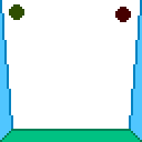

This is my first attempt at a sunset in GIMP. I ran into some serious trouble trying to export it to the gif format as the color gradient exceeded the recommended 256 color limit for the palette.

I compromised by setting the palette to an indexed web-safe set of colors and then applying a Gaussian blur and a noise filter to smooth out the dithering. It seems better, but I believe that I will need to be a lot more aware of the limitations I am faced with in the future.


This is my first attempt at a sunset in GIMP. I ran into some serious trouble trying to export it to the gif format as the color gradient exceeded the recommended 256 color limit for the palette.


I compromised by setting the palette to an indexed web-safe set of colors and then applying a Gaussian blur and a noise filter to smooth out the dithering. It seems better, but I believe that I will need to be a lot more aware of the limitations I am faced with in the future.


Things proceeding fairly well on 445, my 3D animation class. Here is my current run. I need work, especially on the background characters, but I hope the camera flows well enough for now.
Weekly Blog 6 - 10/9 to 10/15
Followed a few tutorials over the weekend, mostly reworking old entries with new tools. I really enjoy the gradient and pattern tools in GIMP. There's a nice amount of stone and wood and water textures I've been able to overlay my images with to add more variation and depth. For the narrow green and orange stripes on the upper and lower edges of the lollipop I took a basic spiral with even proportions, cut out an oval shape, then compressed it vertically until it was a rough circle. I'm happy with the effect.

The reworking of the flower with some basic gradients is something went fairly well, but I want to revisit the bends and shades of the petals and stem with proper reference. Another assignment was to make placeholders for powers and items... but I got carried away with the different tools and symmetry so much that I lost focus on what the shapes were supposed to represent. For instance, the stock GIMP red tile texture I used as a base for the third shape's background had a curved crack - it took me posting these icons in the GameDev.tv Discord and asking for advice on what they match up to, to realize that the curved crack could be a planet silhouette and the tri-dagger-ish shape would easily fit a spaceship.


I usually work with two or three layers of patterns and then set the layers to multiply, overlay or grain. For the sword I believe I started with some wood patterns, played with the hue slider, made a new layer from visible and used the smudge tool to make the background less distinct.
My current favorite way to start wrapping up a project is to create a new layer from visible, apply a gaussian blur so that the areas of light and shadow flow better, then play around with the transparency and other layer effects so that the base detail of the previous layers show through.


During the main part of the week, I made more content and combined previous entries in odd ways. Expanding my old 32x32 flame texture to have a reflection in a 48x48 frame was a fun process and I hope to use it as the basis for an animation later.


I also started using the GIMP tools for animation which proved to be very helpful for assigning frame rate to individual frames. It is mainly a matter of taking the intended frame rate, dividing it by a thousand and writing that amount in milliseconds at the end of the layer's name. A given frame in a 10fps animation would be on screen for (100ms) and changes to the acceleration and deceleration can be carried out easily from there. Important note: the system recognizes certain commands in order, such as (250ms)(replace) and not the other way around, which can cause odd errors in layer transparency.


(replace) is shown here on the left, with the transparent section of the animation only showing the background wallpaper of this webpage. (combine) - the default behavior - has the transparent sections showing visible portions of previous frames/layers throughout the .gif loop.
Weekly Blog 5 - 10/2 to 10/8
Went ahead and put more time into skill building and following tutorials. Finished a résumé and portfolio building course that has a heavy focus toward building up your game development network using LinkedIn.


 I fell way behind on my work in general and only have a little progress to show in the GIMP sprite tutorial. I made an attempt at some fire sprites using a limited set of tools, although I'll definitely want to refine them before using them elsewhere.


 I made a planet map by playing around with the fill pattern tools, then shrank it to create the corner symbol on a map. I had created a small palette using the blending function of the
eyedropper tool in GIMP and used it as a base source of colors, although I gave myself free reign with the hue slider and layer effects. I made a rough attempt at applying shadows and highlights through multiply and overlay layers, and tried adding a dark outline for more pop. I made a basic dagger, a spiked shield and then reused the outline of that to make a jeweled ring.
I made a planet map by playing around with the fill pattern tools, then shrank it to create the corner symbol on a map. I had created a small palette using the blending function of the
eyedropper tool in GIMP and used it as a base source of colors, although I gave myself free reign with the hue slider and layer effects. I made a rough attempt at applying shadows and highlights through multiply and overlay layers, and tried adding a dark outline for more pop. I made a basic dagger, a spiked shield and then reused the outline of that to make a jeweled ring.


I fell way behind on my work in general and only have a little progress to show in the GIMP sprite tutorial. I made an attempt at some fire sprites using a limited set of tools, although I'll definitely want to refine them before using them elsewhere.


I made a planet map by playing around with the fill pattern tools, then shrank it to create the corner symbol on a map. I had created a small palette using the blending function of the
eyedropper tool in GIMP and used it as a base source of colors, although I gave myself free reign with the hue slider and layer effects. I made a rough attempt at applying shadows and highlights through multiply and overlay layers, and tried adding a dark outline for more pop. I made a basic dagger, a spiked shield and then reused the outline of that to make a jeweled ring.


Weekly Blog 4 - 9/25 to 10/1
Sigh. Did not have a very productive week. Watched some more video lectures. Drew and refined a random goose and some small houses. Rushed through a more thorough cover letter for the Jam City Narrative Designer application before the assignment deadline, but failed to follow proper naming conventions. Fixed some bugs in Wandering Robot and drew up a plan for embedding browser-ready versions of my games inside my portfolio. Just worn out from needing to deal with random ailments and replacing my broken fridge.
Sigh. Did not have a very productive week. Watched some more video lectures. Drew and refined a random goose and some small houses. Rushed through a more thorough cover letter for the Jam City Narrative Designer application before the assignment deadline, but failed to follow proper naming conventions. Fixed some bugs in Wandering Robot and drew up a plan for embedding browser-ready versions of my games inside my portfolio. Just worn out from needing to deal with random ailments and replacing my broken fridge.


Weekly Blog 3 - 9/18 to 9/24
I'm starting off with the section on 32x32 sprites and have made a radial woven rug thing. I also started up the course on integrating Git functionality inside the Unity editor. Looks cool so far.

I joined up with a team of two other Chico State students and helped code a game in 36 hours for the local jam that ran from 5pm on the 18th to the 20th. I had a major refresher on how to design a clickable grid that uses 2D collisions in Unity. I programmed the movement and collectibles system for a robot that jumps in a straight line towards where you click if the landing spot is in range.
After the local jam ended, we retooled it and submitted it for a second jam that runs from 10am on the 18th to the 24th - we were very lucky that the theme and design were already spot on for the VimJam's rules and that they were good with us having already submitted the game to a jam overlapping with their time frame. Should be cool when voting opens tomorrow.

I completed a Game Design online course and received a fancy certificate.

I began the process of recoding my past team game jam entry MicroManagement as a Unity 2D game from its original 3D code, in hopes of getting it ready for an eventual paid release on Android. Jeff Underwood, a Computer Animation Game Design teacher, who is livestreaming games for one of the local clubs, said he'd be down for doing a live run through of the game if he had time at the end of the October 3rd session.
I'll be animating these sprites that Jae designed for the game, should be fun. I will be adding in jumping movement to the tracks and more fluid arms - hopefully through a Spriter Pro spine system. I hope to have the antenna react to the environment, squishing when the character jumps into a low platform and such. It'd be nice if the veins in the background pulsed a bit, and the brain synapses had more steps than just on and off.


Jae's original artwork that I will be altering and animating
This would be my second Android Play Store release, my first being a free three-person semester long student project called WarpSpeed!2D. I handled the touch control movement and power-ups for the space top-down Shoot-Em-Up, as well as implementing a local leaderboard (individual to the device running the app) to keep track of scores.

WarpSpeed!2D base sprites by Austin Moore, Cover design and layout by me
I also worked with Austin, the game designer and main artist on WarSpeed!2D, on this 2018 animatic for CAGD 345, about two cannonballs who have love at first sight.
Animatic of (mostly) Austin's Art with Motion and Soundtrack assembled by me
Weekly Blog 2.5 - 9/12 to 9/17
This week I watched (and rewatched parts of) around ninety minutes of a video course teaching me how to use the free drawing software GIMP. The program setup and exercises outside of the lectures took me over an hour total to complete, with my main results being a series of 8x8 icons (scaled up here to 32x32).
They tell some stories about someone who likes bowling


Someone walking their dog in the park 


And someone flying away from Earth in a rocket 


Heh. Not terribly impressive yet, but if I stay on track with the course, I'll be running with 32x32 sprites tomorrow and animating them in a week or so.

From GameDev.TV
I purchased some prototype asset packs from PVGames 2.5d Graphics and used some of their stock water and ground textures along with a bridge and a bush to update my oddly colored sketch of the first two scenes in Star Trader to this stage:

Bridge, bush and some ground/water textures licensed from PVGames (and recolored)
This is a step forward in terms of having a solid stage for me to animate my characters on - but it is a long way to go in terms of the total game. What this background represents is the joined scenes of F1 & F2 on this hex map - where all 31 inscribed rectangles represent the base scenes of the overworld.

ST:TFD (False Color) Hex Map
I also put a good six plus hours into blocking out a scene based on an Scott Pilgrim vs. World (2010) sound clip as part of my team project in 445 Animation Production.
Rigs are licensed via free-to-use policy from Gumroad and ArtStation
I'm not sure how much of this twenty-seven second short is going to wind up in my final portfolio 3D demo reel... But at least everything should turn out a lot more fluid than the one I made for my Spring 2019 class.
Humanoid rigs here via paid license from Gumroad. Tiger rig has a free-to-use license
My friend Jae L. gave me the go ahead to add more detail to Micro-Management - a 2018 Global Game Jam entry where she came up with the core idea and drew all of the 2D art. I was one of two programmers, alongside T. Rex H., and I mainly handled the coding for the 2D animation and the UI.
My introduction and video walkthrough for the game. Art and Concept by Jae Lehman
I believe I'll probably work on the probably more straightforward task of animating her static backgrounds into something with pulsing veins first rather than diving directly into adding flickering flames and flowing lava to my volcano background.
Heh. If I can wrangle Spriter Pro for 2D animation, I might add a skeleton rig to an updated version of my ogre mage from my Butte College flash animation class years and years ago. That does seem to be an ongoing issue to me setting up long-term plans for my portfolio - having a lot of ideas and no solid overall scope. But, steadily working through my video tutorial course daily and incrementally improving my game art for my personal projects and my 3D animation skills for my Scott Pilgrim team submission... should add up to something cool at the end of the semester even if I don't have a final picture of what that will be yet.

Weekly Blog 2 - 9/11 - Concept Statement
For my animation, I'm going to be animating this crystal fungus attack on this dome, redrawing the crystals from the ground up. This will be in traditional digital art.

Image Commissioned From Jae L. for this game project

General Concept of Crystal Fungus in Motion
I'll also be rendering this scene in animated pixel art with several 'Stemmo' fungus monsters, based on this general turnaround.


Early general sketch and block-out of first two player accessible scenes in ST:TFD


Stemmo Concept Art. Early Attempt at Pixel Version
If I can wrangle Spriter Pro this semester, I might want to add a simple 2D skeleton rig to my pangolin and have it execute a claw swipe. I would also like to animate my volcano concept art into a looping environmental background with flickering light and flowing lava.


Concept Art from my work on 'Elementalist' for CAGD 495
Here's a brief example of a demo reel by DucVu FX to show off some of their 2D rigged characters in a similar program to Spriter Pro called Spine.
Weekly Blog 1 - 8/31 to 9/10 - Résumé and Star Trader: TFD production
This week I updated my résumé (using an InDesign template by 'afahmy') as well as my LinkedIn page. I filled out (without submitting) an application form for a mobile game development company called Jam City and set about making cover letters for both that and for this class. Following advice, I started uploading my artwork to an ArtStation page as the base for a more straightforward portfolio. I also updated my Patreon blog with a long post on how I went about designing some artwork for my Advanced Production Game Design class last semester.
I followed several exercises from a GameDev TV tutorial called "How to Get a Job in the Video Game Industry" on building an online presence and building targeted résumés. I put some time into the Star Trader: The Folded Dimension indie game I am making and compiled the finished slides for the intro sequence that I commissioned from Jae L. I hope to animate these slides and improve my skills.
I worked with my 445 team on blocking out the 28 seconds of 3D animation that will also be part of my animation portfolio. It is based on an audio clip from Scott Pilgrim vs The World (2010).
In general, most of what I did was undirected prep work. I hope to be more focused in the coming weeks.

September Résumé of Warren "Stephen" Rose II
Here are the slides of Concept Art and Level Design that I commissioned from Jae L, one of my steadfast teammates on past school-related projects. Note: This is not artwork that I colored or drew myself. It is art loosely based on my sketches and composite drawings and captions that I wrote for the game I hope to build. We threw many ideas and sketches and Unity 3D perspectives back and forth on the progress from thumbnail to rough to finished and colored line art. (That said, Jae made the layout for Amaterasu herself wholesale - I am very impressed).
I'll be texturing and shading the artwork and animating (mostly simple movement and loops of color cycling) the different layers of the Photoshop document until I have a working game intro. ... ... Once I figure out exactly how to wrangle the crystal fungus into a workable movement scheme.
ST:TFD Concept Art by Jae Lehman based on captions and feedback by Warren "Stephen" Rose II


Comments
Post a Comment